Page 1 of 3
Club Logo -- Time to VOTE!
Posted: Wed Jan 24, 2007 3:57 pm
by mark
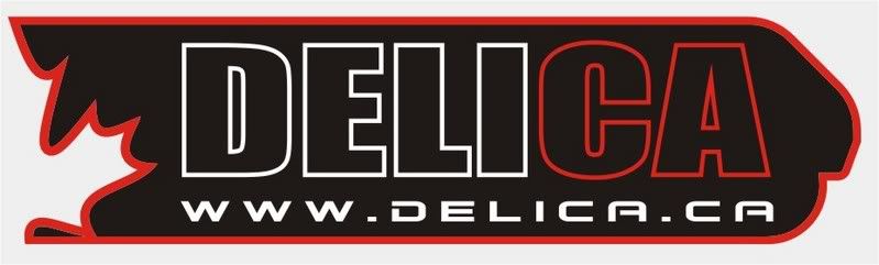
Bruce (Mystery Machine) has generously contributed some well-crafted logo designs for DELICA.CA. Please review these and then vote...
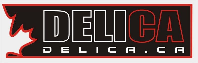
OPTION 1:
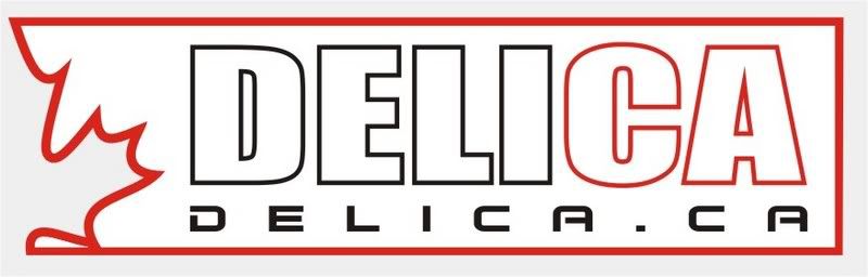
OPTION 2:
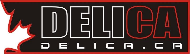
OPTION 3:
OPTION 4:
OPTION 5:
OPTION 6:
OPTION 7:
OPTION 8:
OPTION 9:
Polls will remain open for THREE DAYS.
Many thanks again to Bruce for his efforts...
[/url]
Posted: Wed Jan 24, 2007 4:16 pm
by mitch
yeah i'll jump on the bandwagon with #7
Mitch
Posted: Wed Jan 24, 2007 5:49 pm
by Kuan
oops I like #6 but voted for #7 by accident....

Posted: Wed Jan 24, 2007 6:25 pm
by BCDelica
I like 6 and 7, but which would look better on a tinted window?
Posted: Wed Jan 24, 2007 7:23 pm
by surferboy
7 or 9, but yes, i'm thinking to put it on a tinted window as well, so maybe the white version of them...
Posted: Wed Jan 24, 2007 7:59 pm
by Mystery Machine
BCDelica wrote:I like 6 and 7, but which would look better on a tinted window?
Maybe I can help with that one.
I'd suggest voting for the one you like the look of 'on screen' over anything else (i.e. just for the website) I can make variations on the theme after the choice is made.
Go more for the one you want to see on here the most - I was going to make stickers using silver instead of white anyway, they tend to look better on a motor.
Get the website one chosen and the rest will follow....

This is just the start of the logo!!! (we've got the branding stage next! :lol: )
Regards,
Bruce (can't sleep :( )
Posted: Wed Jan 24, 2007 8:35 pm
by josh
I voted 7
Great work, and so efficient. Thanks Bruce.
Josh
Posted: Thu Jan 25, 2007 12:56 am
by username
nice work, i voted for #7.
i think if we start putting those stickers around the usage of this site is going to explode.
Posted: Thu Jan 25, 2007 3:05 am
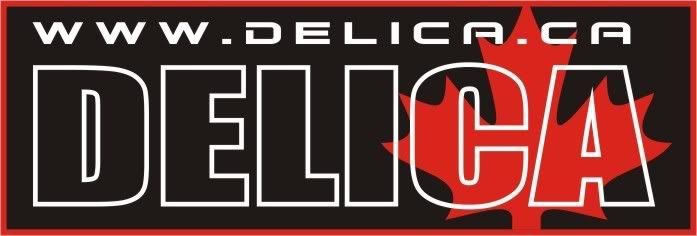
by Mystery Machine
OK then guys - seeing as Option 7 is the current fave (along with option 6 - i.e. the same design
) I have had a play with it to see which way we can go with it for other applications (stickers etc)
Here is a variation of Option 7 - with the wording made solid...
White:

Black:

Is it TOO much?? Is the lettering now to 'in your face' or was the original too subtle??
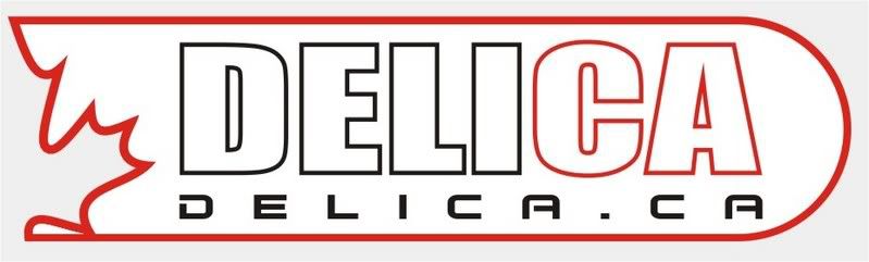
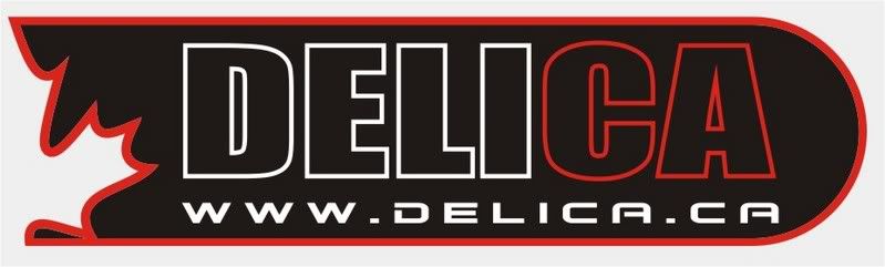
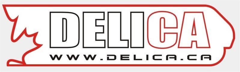
Also - here is a quick look at how it transposes to a single color for vinyl stickers etc....(whilst still keeping the CA distinct)
RED 'outline':

BLACK 'outline':

RED 'solid':

BLACK 'solid':
 Please remember that I can make this single colour sticker in ANY colour, not just red or black - SILVER would look cool......or how about CHROME!!
I'll have a play with how it all works on some products and get back to you later....
Cheers for now guys.... :D
Bruce.
Posted: Thu Jan 25, 2007 8:37 am
by Mystery Machine
I've unfortunately had to sort other things out today, so have not had much time to spend on this! :(
However...I was inspired by this comment:
Pete and Jackie wrote:Try the new "Delica Beer" Our bottles are larger on the inside, giving you a longer more unpredictable thirst quenching experience! Prices may vary.
So inbetween jobs, I came up with this:
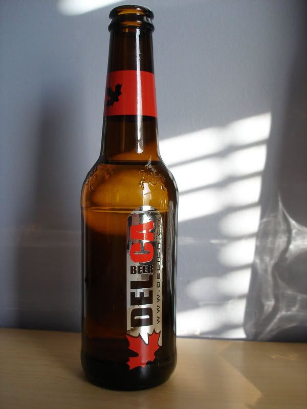
:lol: :lol: :lol:
So CHEERS!!! - here's to you guys..... :D :D
Posted: Thu Jan 25, 2007 8:41 am
by Mystery Machine
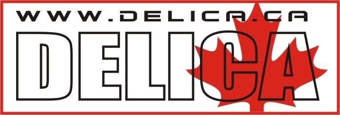
Further toying with the more popular design - any thoughts on these??

Not too sure myself?? - out of the two, I prefer the second one myself (more subtle and the Mitsy logo echoes the maple leaf more.....'cut-out' stylie) but if you don't play around with the design, you're never really sure if the one you think you like is
actually the best one (if you catch my drift?? :lol: )

Regards,
Bruce.
P.S. Before anyone panics about copyright, using the Mitsy logo in this way is fine because there is more than 25% difference in the logo compared to the original....
Posted: Thu Jan 25, 2007 10:56 am
by Mystery Machine
Had time to play a bit more here!
Don't expect a sticker lik this, but I can sure make mugs & mousemats with this on....

It is MUCH more crisp in 'real life' - the photobucket re-sizing seems to have made the definition much more vague and fuzzy! :(

Regards,
Bruce.
Posted: Thu Jan 25, 2007 11:15 am
by surferboy
:D wow bruce, you read my mind, the variation of the #7 sticker with the mitsubishi logo is pretty much what i had in mind, my favorite so far! any luck with that cool box removal?..... :)
Posted: Thu Jan 25, 2007 11:24 am
by Mystery Machine
Cool box out (removed last night).....
Bad news - I forgot to take photos! (too cold & dark and was just focusing on getting it out!)
Will PM you some details tomorrow... :D
Which of the 2 Mitsy logos do you like?
Regards,
Bruce.
Posted: Thu Jan 25, 2007 12:24 pm
by surferboy
both are cool but the first one is my fave, did you try reversing it like putting the maple leaf at the end and the mits logo shape at the front? lets give it a try... :P